Thursday 25 February 2010

Jay-Z Font Testing


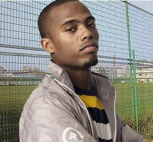
I designed these same three pictures on the Hip-Hop artist Jay-Z to try and the different colour schemes. After i had finished them i asked my friends and classmates what they thought of the name as this was the first time i had really tried out the name and also the colour of which they think goes better yellow/gold or red. The feedback that i was got back was that people thought both of the colours worked well and liked them both but the yellow/gold gave a sense of power and riches and its gold but the red worked well and it’s a conman colour to be used with a music magazine as it stands out and goes with a lot of other colours. However a large percentage of the people i asked said they thought the title was good and very fitting for the genre as i have chosen a Hip-Hop/fashion Magazine. So my feedback was mixed in what colour they thought worked best but also very helpful.

Monday 22 February 2010

Idea's for font

I came up with these ideas for the title of my magazine and asked some of my friend's for their ideas and what they think about them. The main idea's which i came up with at first were; bold, flamboyant and smart. This is because I feel that is how hip-hop can be described. Bold as most of the artist are loud and speak about their lives and can they see thing with their views. Flamboyant as the artist have a lot of money and like to spend big also like they have the better things in life so they stand out. I asked a number of people what they thought of my ideas for my fonts and the main reaction i got was that number 2 was the best for my magazine. The reasons for this were because it stood out straight away when they looked at it and they felt it would best suit the genre. I had a few suggestions that I should try using a different and they suggested gold would be a good colour to use.

Thursday 18 February 2010

Monday 15 February 2010

Friday 12 February 2010

Kid Cudi Edit 2

On this edit of Kid Cud I tried to link the title of his album which it “Man on the Moon: The End of Day”. So I decided to do an edit to make the effect that he is looking down on earth from the moon. It is a very simple edit as I have only used three layers; a plain black background, picture of Kid Cudi himself and a picture of earth.

Wednesday 10 February 2010

J.Cole Edit

On this edit of J.Cole I tried new thing such as; playing with the effects and seeing what they all did and looked like also as you can see I tried adding a tattoo on the side of his neck which I feel has worked nicely. Also as you can see below I have used to picture of the hat and cut that out and rotated it then place it in the right place.

Kid Cudi Edit

This is a very basic edit with only two layers because this is one of the first edits I have done so it’s very simple and I was just practising being able to cut the shape out neatly and putting the picture of a suitable background. As you below I have cut out the picture of the rapper Kid Cudi and just simply place the cut out on top.

B.o.B Edit

This is a very basic edit with only two layers because this is the first edit I have done so it’s very simple and I was just practising being able to cut the shape out neatly and putting the picture of a suitable background. As you below I have cut out the picture of the rapper B.o.B and just simply place the cut out on top.

Tuesday 9 February 2010

XXL Magazine

I looked at XXL magazine mainly because I like the title of the magazine “XXL” as it is extra, extra large which links the genre of the magazine to the genre of hip-hop and rap, as the life styles of hip-hop and rappers are extra, extra large and extra, extra large personalities usually.

The Source Magazine Cover Three

The design of this magazine cover is very simple but at the same time very effective. It only has three colours which are black, white and red. It has a large picture which takes up the whole page which tells the audience who the main feature of the magazine is in this issue. The picture has been taken in a mid shot, so the main focus is their faces and the clothes which they are wearing. The font that has been used is bold an edging a bit like the genre of the magazine which is hip hop. The biggest font which is on this cover is the name of the group also the title of the magazine, the two main words on the cover.

The Source Magazine Cover Two

The Source Magazine Cover One

The design of this magazine cover is very simple but at the same time very effective. It only has three colours which are black, white and red. It has a large picture which takes up the whole page which tells the audience who the main feature of the magazine is in this issue. The picture has been taken in a mid shot, so the main focus is his face and the clothes which he is wearing. The font that has been used is bold an edging a bit like the genre of the magazine which is hip hop. The biggest font which is on this cover is the name of the artist also the title of the magazine, the two main words on the cover.

Monday 8 February 2010

NME Magazine Two

I like this magazine cover as it’s very simple with little writing but as it has a lot of picture of many different artists it seems like a lot more is doing on and makes it seem busier. They have only used 4 colours on this cover of the magazine which I like because it keeps it even more simple as the main colours that have been used are; black, white and red. Then a little bit of yellow to say something that is inside the magazine and the page it is on, yellow has been used as it sounds out and your eyes are drawn towards it. I feel the pictures that have been used on this cover are very effect as that they all go together nicely without any spaces between the different people as the designer has taken many different pictures and has put them together with a good effect. This has given me a few ideas as I may want to do a similar idea. The magazine cover also has the things which you would normally find on the cover such as; the date the issue number and a barcode.
I feel that used contexts page it very effective, simple and easy to read. This really fits in well with the audience, which are teenagers and young adults. My magazine is to have s similar audience. It is very simple as it has one large picture taking up all most the page. This picture also links to the target audience as the picture is of a band looking natural playing music in a room which is what a lot of young musicians do. The list of items in the magazine down the left side of the page, the start of an item which then says what page this item is taken from so that the reader turns to the page and reads on. It also has an advert at the bottom of the page which is advertising a subscription to the magazine at a lower price. the font that has been used for the headings is good as its bold and just stands out which is what these young bands want to be like.
This double page spread is very simple and clean, with clean neutral colours, mainly grey and white. They have used one picture which take up half of one side which looks good but i feel its hard to make out who they are as you cant really see they faces very well and because of this i feel i am going to used a large picture to take up most of one side of my double page. I like the way that they have used a timeline at the bottom of the page which take you what they have done in the past and gives you dates, so if your unknown with the band you can see and learn what have done before. The item has been written in columns which i feel is the best way to write and it also has quotes taken from the text, which have been enlarge and put in bold.

Saturday 6 February 2010

NME Magazine


I decided to look at the NME magazine as it is one of the most popular and best selling lately as it features the biggest stars in the music industry at the current time. This particular copy of NME magazine I have looked at features Simon Cowell one of the most well known faces in music at this moment in time. The front cover is mainly taken up by a very large picture of Simon Cowell as he is the main feature of this week’s magazine. Also at the top of the page they have the title of the magazine, which i feel that the top of the page is the best place to place the title of the magazine as the top of the page is most likely to be the first place to look when the magazine is in the shops. The colours that have been used for the title is a bright red which really stands over as it’s the brightest colour on the page which I like as it’s the name of the magazine so it’s important that people see that. As most of the page has been taken up by a large picture of Simon Cowell they have also made room to say what else is in the magazine which stand out because of the colours they have used but i feel that they are maybe a bit to see and should be bigger.

I like the design of the contexts page, as it is very simple but effective. As it just have the items in the magazine in a list at the side of the page but is very clear and simple which I feel is the best way to shows the items and their page numbers. Also just like the front cover they have used a very large picture which takes up most of the page with a little bit of text at the bottom of the picture which is the opening bit of text from the item. They also have an advert at the very bottom of the page trying to get the readers to subscribe to the magazine also it has offers on the advert which will make the reader think its a better deal and more likely to subscribe to the magazine.

The first thing you notice when you see the page is the dominating picture of Simon Cowell of which takes up the whole page, who the item is about. The title is in a large font which starts the item off. Underneath the title is a short opening paragraph to introduction the text. This short paragraph is in a smaller text than the main title but bigger then the main text. The main text is written in columns which spreads the text out nicer, I believe. Also on this page it has a larger bold quote of what Simon Cowell has said in the item. I like the colours that have been used in this item as the colours are neutral, clean cut and intelligent just like Simon Cowell. So I feel they the designer of this item has really thought about the colours that he has designed and used.

Friday 5 February 2010

Mood Board

I have chosen to use these pictures in my mood board because they are all thing to do with music such as cars, money, expensive clothes and footwear as the music industry is seen to be big spending and “the high life”. I decided to put pictures of Kid Cudi, Pixie Lott and Lil' Wayne as I have not decided the final genre of magazine that I am doing. I feeling that it is most likely to be either hip hop/rap or indie pop. Also in this current time these are three of the biggest raising stars of the music industry. I have research current magazine that are in the shops at the moment and there isn’t many or if any hip hop/rap magazines made in the UK, all of the hip-hop/rap magazine are u.s.a based. Where as there are a lot of indie pop magazine as this genre is very popular at this moment of time.